Thursday, 31 March 2016


Evaluation Question 3
What have you learnt from audience feedback?
The production of my music video has been designed in order to appeal to a specific audience demographic I identified in the early stages of production. This approach attributes to Stuart Hall's Reception Theory, which depicts that the producer encodes the media text in a specifically for the audience to decode it, which is something I indefinitely did- making the music video a direct reflection of the age and social demographic of the primary audience. Furthermore the audience feedback I have collected from fellow media students who fall within my age demographic, as well as anonymously via an online survey service (Survey Monkey) in order to broaden the response I receive. Predominantly the feedback has been dominated by a hegemonic opinion, meaning the purpose of the text has been received as it was intended by the audience.


the other two responses that explicitly recognise the the escapism and day-dreaming purpose of the video; this serving as a way for the protagonist to break away from everyday norms. The answers to Question 5 differentiate the most, but all fortunately pick up upon different intertextual references transgressed throughout the music video. The top response has realised the link to C.S Lewis novel 'The Chronicles of Narnia'. The second response recognises a pop-art approach, something I then carried through onto my print productions in order to reflect the origins of the pop rock genre, (e.g The Beatles (rock), Madonna (pop). The third response again links to a textual reference to Alice in Wonderland, our production drawing inspiration from the surrealism Alice experiences within Wonderland as well as the development of youth and growth in personality as the narrative progresses, so I feel very fortunate that this reference has been noticed.


 The responses from fellow media students predominantly identify the post-production of the music video, which is a nice variation in feedback to receive as opposed to the content response I received from my online survey. All 3 responses here are from male viewers, our demographic for the artist being predominantly female ,(due to the female star protagonist and lack of Laura Mulvey's male gaze theory), so I thought it would prove to be interesting to examine the responses from a male audience. I felt like the response from a male group was mostly positive, they responded generally well to the overall video, two answers rating it 5 out of 5, one male rating it a 4.5. However, it is obvious that the most appealing part of the video to this male group of media students is the camerawork and edit, "editing left me gripped" and "use of colour" in response to what their favourite part of the production was. There was no strong comment on narrative other than "clearer story", which I appreciate the criticism but in relation to Hall's theory, the intended primary audience was not male, therefore it is understandable that as a viewer he was not able to decode the text so thoroughly.

(relationship between music and visuals), keeping with

 quick beat of the track. The edit was generally praised and the camera work, "really strong shots", well commented upon also. I was most pleased with how well the video managed to maintain the audience's attention across all feedback forms. Notes such as "edit left me gripped" and "held attention well" both describe how the video was the right length and transgressed an entertaining narrative. Conclusively I am happy with the feedback, it demonstrates that our intertextual references were explicit, the editing and chronology of the narrative took effect and captivated both the primary audience as well as the secondary male audience, an added bonus. The locations translated the British aspect of the track, and the comedy we attained through use of actress was recognised.
Finally I enlisted the feedback of Charlotte Ball, art and music student and someone who listens to many artists of the same genre as my track. I asked her opinion of my print productions, this was her response:

As Charlotte mentioned, the art-pop nature of the panels really transgressed to the audience, eye-catching it appearance as well as reflective of the bright colours used within the music video. It is obvious she appreciated the slightly less intense aesthetic of the back panel- this contrasting and emblematic of the more 'dreamy' notion of the day- dreaming sequences; (intertextually inspired by Taylor Swift's 'Style' music video promotion). I'm glad she recognised the use of font, this minimalistic in order to project a professional and individual look for the artists. The biggest risk I took throughout the print productions was merely having the beach huts on the advertisement, not the performer which I have had previously on all the panels of the Digipak. Charlotte noted the cultural projection the use of these beach huts carried, and how it reflected 'American minimalist' style, this intentional as it suggests the 'pop rock' genre of the track.
Evaluation Question 4
Here is the first evaluation of the technologies I have used over the course of year on Blogspot and how they have helped me in my studies:
As apart of the shoot and also when we took photos for the print production in a photography studio, a series of technologies aided our production then also:

 I used a grey scale filter to represent reality in contrast with the high saturation applied to the dream sequences; in making these moments brighter the footage is thematically demonstrating positivity and happiness through exaggerated colour.

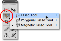
 In Adobe Photoshop for my print productions I used a 'poster edge' filter in order to posterise each of the panels- branding them with a more retro appearance. Influenced by the bright colours used my iconic artists such as Madonna and Bowie I also made the saturation higher and contrast lower to develop a more 'pop art' kind of image. Similar to the ghosting effect I used in Premier Pro, for my inside two panels I used the blur tool to blend an image of the sea into an image of the ocean to again connote the concept of reality and dream time becoming one. The back panel was definitely the most challenging to create, I tested out several methods of applying double exposure before I was left with a professional looking final production. As you can see, my first attempt at combining two images looked incredibly messy as I considered the possibility of sampling each of the dream locations within the video, however I decided this over crowded the image. Finally I overlapped the layers of an image taken at Cromer beach (a primary location within the video) and the silhouette of the protagonist and lessened the opacity of the silhouette then used the eraser tool to leave the background around the outline white. Inserting text was straightforward, and I tried a few different fonts from Photoshop before settling on 'American Modern'- a font that reminded me of an art-deco kind of appearance. Putting the stars on the magazine advert was relatively easy also, as I merely took a opaque image of stars off of the internet and able to easily move them between the layers without having to individually cut them out using the lasso tool.
Inevitably along the way, problems with technology occurred- most frustratingly several SD cards corrupted after large amounts of footage had been recorded hence leading us to having to re-shoot the entirety of the forest sequence.
As apart of the shoot and also when we took photos for the print production in a photography studio, a series of technologies aided our production then also:


The post-production was one of the more significant and integral parts in creating the overall product, hence the after effects I need to apply were very important. To edit the video I used 'Premier Pro', an editing tool which allowed me to cut clips together, alter colour (saturation, contrast) as well as flip clips horizontally and vertically in order to form a more diverse edit. There are several utilities that aided me most within the 'Premier Pro' process, one being an appliance called 'ghosting', which essentially enabled me to blur the shots between real-time and dream-time to suggest to the audience the recognition between the two sequences were becoming merged.
 I used a grey scale filter to represent reality in contrast with the high saturation applied to the dream sequences; in making these moments brighter the footage is thematically demonstrating positivity and happiness through exaggerated colour.

 In Adobe Photoshop for my print productions I used a 'poster edge' filter in order to posterise each of the panels- branding them with a more retro appearance. Influenced by the bright colours used my iconic artists such as Madonna and Bowie I also made the saturation higher and contrast lower to develop a more 'pop art' kind of image. Similar to the ghosting effect I used in Premier Pro, for my inside two panels I used the blur tool to blend an image of the sea into an image of the ocean to again connote the concept of reality and dream time becoming one. The back panel was definitely the most challenging to create, I tested out several methods of applying double exposure before I was left with a professional looking final production. As you can see, my first attempt at combining two images looked incredibly messy as I considered the possibility of sampling each of the dream locations within the video, however I decided this over crowded the image. Finally I overlapped the layers of an image taken at Cromer beach (a primary location within the video) and the silhouette of the protagonist and lessened the opacity of the silhouette then used the eraser tool to leave the background around the outline white. Inserting text was straightforward, and I tried a few different fonts from Photoshop before settling on 'American Modern'- a font that reminded me of an art-deco kind of appearance. Putting the stars on the magazine advert was relatively easy also, as I merely took a opaque image of stars off of the internet and able to easily move them between the layers without having to individually cut them out using the lasso tool.
Inevitably along the way, problems with technology occurred- most frustratingly several SD cards corrupted after large amounts of footage had been recorded hence leading us to having to re-shoot the entirety of the forest sequence.
Tuesday, 15 March 2016
Monday, 14 March 2016
Monday, 7 March 2016
Wednesday, 24 February 2016

Friday, 12 February 2016
Print Productions (Final)
FRONT PANEL (PANEL 1)

INSIDE PANELS (PANELS 2 & 3)

BACK PANEL (PANEL 4)

MAGAZINE ADVERT


INSIDE PANELS (PANELS 2 & 3)

BACK PANEL (PANEL 4)

MAGAZINE ADVERT


Monday, 1 February 2016
Audience Profile
Case Study on Audience profile for Fall Out Boy's "Uma Thurman" as well as cross comparison as to how this relates to our chosen track and how certain ideas from Fall Out Boy's video were transgressed into our own production. Exploration on what effects target audiences.
Link to "Uma Thurman":
Link to "Uma Thurman":
Tuesday, 26 January 2016
Absurdist Short Film
This is a short film I made in the style of Samuel Beckett exploring the representation of women for Theatre Studies.




Wednesday, 20 January 2016
Print Production Process
First Draft
This is my first, really rough, draft for the kind of look I'd like my front panel to look like, influenced by Taylor Swift's track Style. The concept is to portray seperate silloheuttes inside one another to connote the seperate layers of someone's mind. In this instance it is reflective of the protagonists seperate dream sequences within the music video. This is only a rough draft and needs to be done neater, and with more creative blending to include images from the shoot in the space within her torso.


Tuesday, 19 January 2016
Print Production Inspirations

The Beatles - Abbey Road
The genre The Beatle's identify most closely with is rock pop, which is similar to the genre of our chosen track, which is pop punk, a more evolved genre of rock. This image of The Beatles is iconic, and I believe the crossings are representative of moving forward, crossing an obsticle within your life. This is what I would like to mimic within my print production, having the backdrop being a crossing like this one but with the different dream versions of the protagonists self walking on after the other across.
Subscribe to:
Posts (Atom)